Transforming raw Fitbit fitness data into an interactive Power BI dashboard tracking calories, steps, distance, floors, and activity intensity — with dynamic slicers for year, month, and day-range exploration.
.png)
.png)
This project aimed to build an interactive Power BI dashboard to analyze Fitbit activity and health data, helping track key fitness indicators such as calories burned, steps taken, distance traveled, floors climbed, and activity intensity levels.
During the data preparation phase in Power Query, multiple files were combined, data types were corrected for date and numeric fields, duplicates were removed, and columns were renamed and standardized to create a clean, analysis-ready dataset.
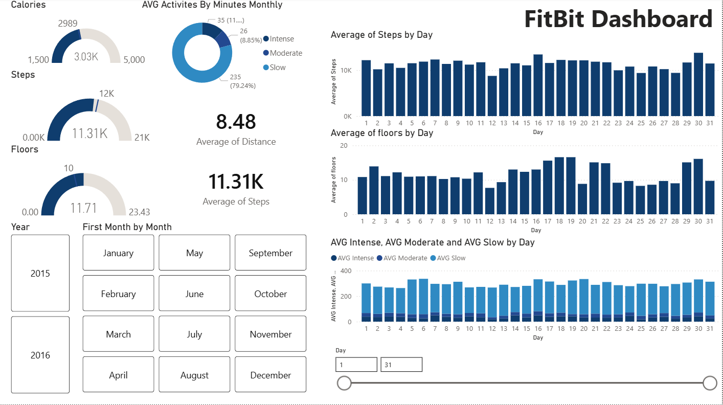
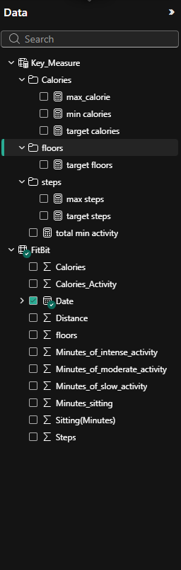
The data model was built around a central daily activity table containing Date, Calories, Steps, Distance, Floors, Sitting Minutes, and activity intensity minutes. A supporting Key Measures table stores target benchmark values for Calories, Steps, and Floors — enabling direct comparisons between actual performance and predefined goals using Gauge Charts.
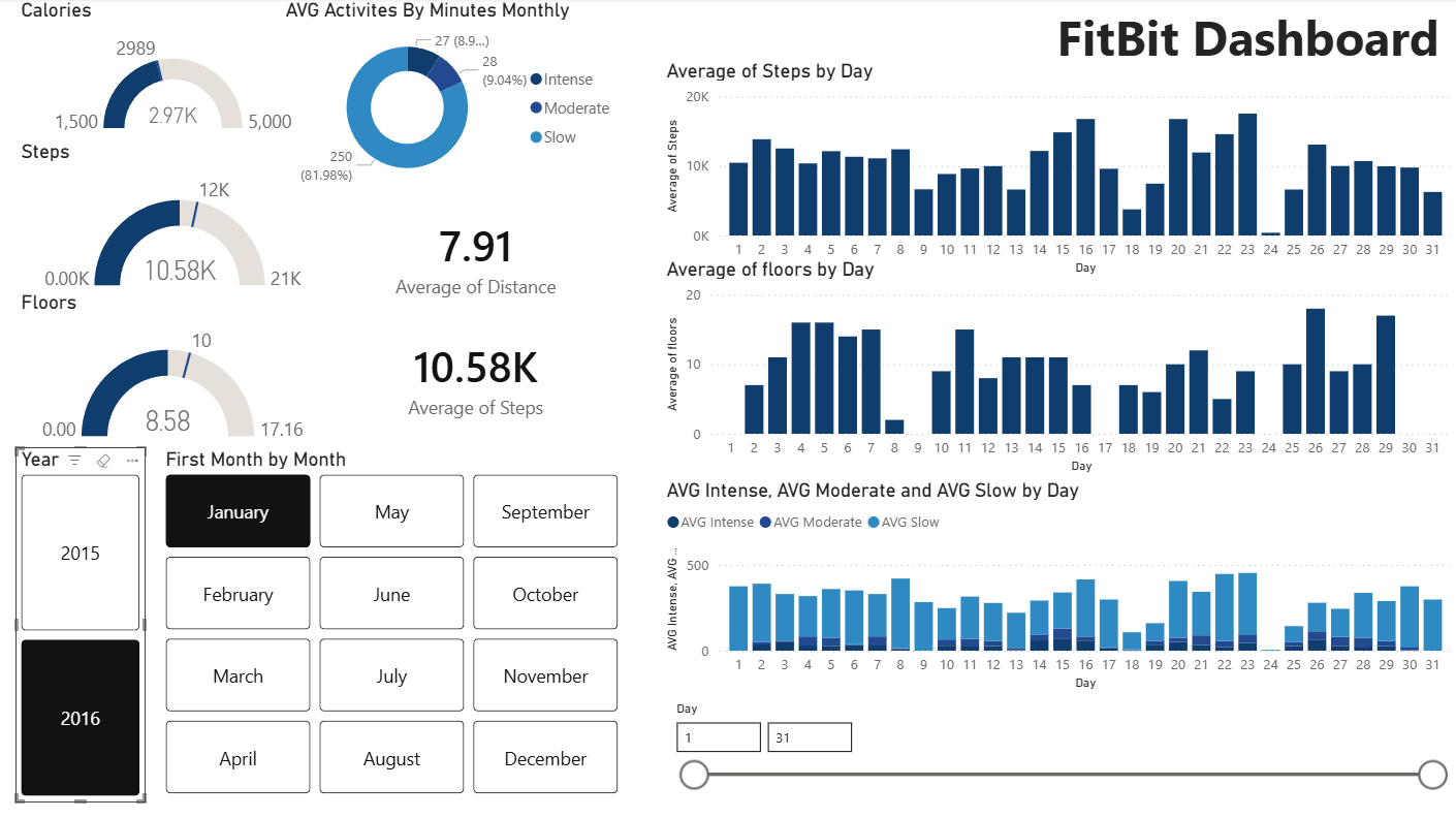
DAX measures were created for Average Calories, Steps, Distance, Floors, and all three activity intensity levels (Slow, Moderate, Intense). The dashboard includes dynamic slicers for year, month (button-style), and a day-range slider for flexible day-level exploration.
Gauge chart comparison showed consistent near-target performance, with peak activity days exceeding 20K steps.
The donut chart revealed that only 11% of monthly activity was intense, highlighting an opportunity to increase high-intensity exercise.
Bar charts by day exposed mid-month activity spikes, suggesting a recurring behavioral pattern in the tracking period.
Year-over-year comparison via the year slicer revealed improved fitness performance across key metrics in 2016.
Gauge charts for calories (target 2989) and floors (target 10) showed the user was tracking below goals on most days, enabling targeted improvement focus.